Ranking Hangsaman Covers
I don't know if Hangsaman is necessarily Shirley Jackson's best work per se, but it is almost definitely my favorite book of hers. To give a very truncated summary, it's a book about a young college student who slowly succumbs to an emotional breakdown and has fantasies so vivid that it becomes less and less clear what is real. I read it in a big one-volume collection of Jackson's novels, so out of curiosity I decided to look up what the covers on standalone copies of the book look like. The results varied wildly, and some of the design choices I saw were truly baffling. I guess it figures that different publishers have vastly different ideas about how to market Jackson's most opaque and difficult-to-interpret book, but some of them were just... like, wrong. I fell down such a rabbit hole looking at these covers that I feel the need to share them with you and offer my own personal ranking, so that together we can gasp in delight at the good ones and stare in slack-jawed horror at the bad ones.
I think a good book cover should give you a sense for what the book is going to contain, and in doing so remain accurate to the actual content of the book. It should also be nice to look at. That's basically all I'm looking for. Easy enough, right? Apparently not.
I'm taking the opposite approach compared to most ranking posts by starting with my favorite and ending with my least favorite. I'm doing this because I found that there were more bad covers than good covers, and also because the worst one is so heinous that it deserves a bit of buildup.
1. (Penguin Classics)
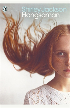
By far and away, this captures the essence of Hangsaman better than any other cover I've seen. The model here actually looks like she could be the same age as the main character Natalie, and her expression perfectly captures Natalie's unease and emotional turmoil. The weird way her hair is moving gives the whole thing a distinctly unreal feeling. My only note for improvement is that I think the wall behind her should be dark, not light.
2. (Penguin Classics)
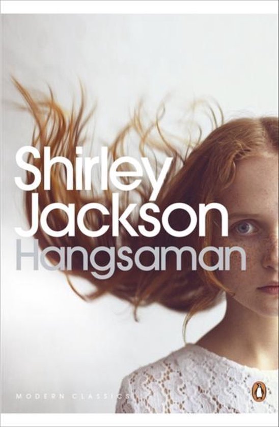
Basically the same cover but the text placement isn't doing it as much for me.
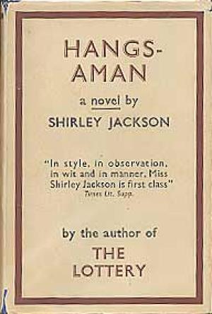
3. (Farrar, Straus and Young)

You can't go wrong with the first edition. It's mysterious and a little dark, and there's some tarot symbolism in the book so the use of a tarot card here is apt. I would almost rather they'd gone with the Hanged Man, since, well, you know, but overall I'd say this cover works really well.
4. (Alfaguara)
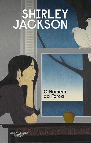
This one's got a lot going for it. It's maybe the prettiest of the bunch, it depicts a scene that could plausibly be in the novel, and it has a nice amount of pensiveness. I do think it is missing some much-needed uneasiness. It's a scary book, so the cover should be at least a little scary. But overall I'm a fan of this one.
5. (HarperPerennial Classics)
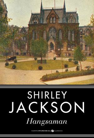
Now we're getting into somewhat dubious territory. This is nice-looking, but pretty generic. The uneasiness factor is once again missing. The university here could be any university, and I don't want to see any university, I want to see something that tells me this is the specific college Natalie Waite went to. Frankly, if you weren't looking all that closely at this cover, you could potentially mistake it for a Jane Austen book.
6. (Rivages)
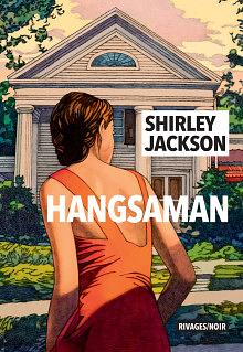
Much love to the cover artist Miles Hyman (who is Shirley Jackson's actual grandson), but while he's captured some of the vibe it is once again fairly generic. You could swap Hangsaman out for Jackson's other novels The Road Through the Wall and The Bird's Nest and this art could work just as well. If you're gonna do a Hangsaman cover, do a Hangsaman cover, not a "whatever Shirley Jackson book fits" cover.
7. (Ace)
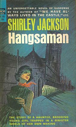
So this is where it starts to get kind of crazy. For a lot of print runs of this book, I guess the publishers looked at the horror elements of the novel and decided to market it as a pulpy thriller/horror. Now, I have nothing against pulpy thriller/horror, but that is not what this book is like at all, and anyone who reads it with that expectation is going to wind up very frustrated. I rate this one a bit higher because it at least has a university on it, but overall this makes it look like the book is going to be about Audrey Horne from Twin Peaks investigating a school full of scary monks. The tagline at the bottom is also technically correct I guess.
8. (Penguin Classics)
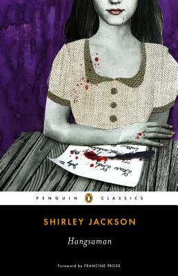
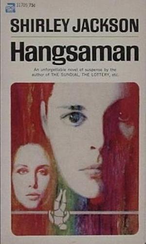
Penguin, what the hell happened! You had a really good thing going! I'll grant that this cover is dark and weird and uneasy, all qualities the book shares. And Natalie does indeed write letters to her father frequently throughout the book. But it is really giving "vampire movie directed by Tim Burton." Why is her skin blueish-greenish-gray. Why is the blood splattering like that. Weird energy, and it doesn't really mesh with the energy of the novel.
9. (Penguin Random House)
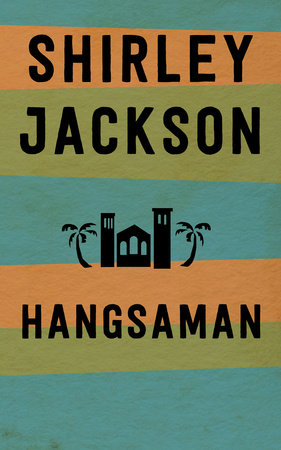
Okay, again, points for having a college in the artwork. But what's with the color scheme and palm trees? I'll grant that it's been a hot minute since I've read this book, but I seem to recall it taking place in New England, or at least somewhere very New England-like. The only beach I remember is on the edge of a lake, not the ocean. This cover feels pretty tropical, which is just wrong.
10. (Ace)
This looks like a 1960s sci-fi movie, and let me tell you, I cannot think of a book that feels less like a 1960s sci-fi movie than Hangsaman. Also, who's the small face supposed to be? Natalie's mom? Elizabeth? The girl Tony??
11. (Gollancz)
I guess the publishers just gave up for this one.
12. (Minúscula)
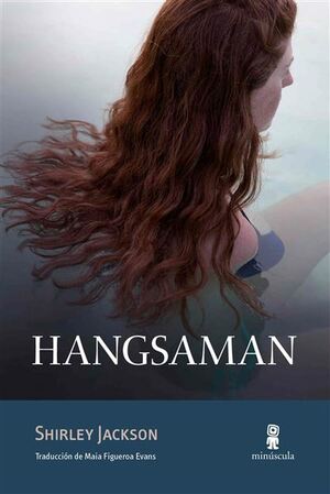
This is just some random woman sitting in a swimming pool. Now, again, it has been a hot minute since I've read this book, but for the life of me I do not recall there being any kind of swimming scene. The closest I can think of is one of Natalie's classmates talking about her family's private island or whatever, but that's not something Natalie ever actually visits. This cover is vague and boring and doesn't even have the decency to be accurate.
13. (Arcturus)
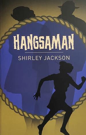
This one is probably technically the worst, although I cannot bring myself to call it my least favorite. Using what looks like clipart is certainly a choice, as is arranging it in such a way to make it feel like a bargain bin Hitchcock ripoff. I do have to give a little bit of credit in that you can sort of get a sense of some of the characters in this novel via the three silhouettes. But only sort of. And even if they got it completely right it still would look hideously ugly.
14. (Popular Library)
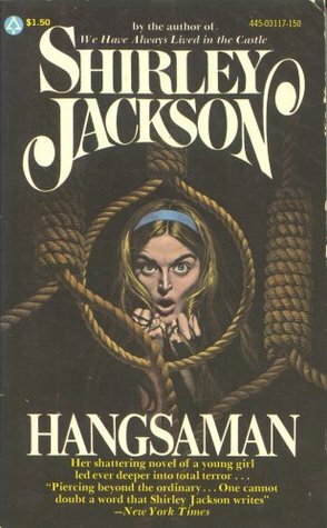
I am absolutely gobsmacked by this cover. I have never seen a work of art that more thoroughly whiffs the assignment than this one. It's like the person who drew it only knew the title and the fact that it was (kind of) a horror novel and invented an alternate reality where Natalie Waite is pursued by a noose-toting serial killer. To be clear, nobody actually gets hanged in the book. There are some good reasons why this book has the title it does, but nooses really don't play into the content of the novel at all. Natalie Waite sitting in a noose-filled attic with a fearful (or maybe angry? Genuinely can't tell) expression is not even remotely close to what happens in this book, and it doesn't metaphorically represent anything in the book either. I got genuinely angry when I first saw this art. I'd much rather have someone think that Hangsaman is a weird vampire novel or a 60s sci-fi thriller than whatever conclusions they would draw from this cover.
So there you go. It may be that you shouldn't judge a book by its cover, but I can still judge some covers based on their book. I'd love to see some more artists take a crack at designing a cover for Hangsaman, especially if they've read and love the book. Until then, when I find myself seeking out a copy of this for my personal library, I at least know which editions I will be avoiding.
For more like this, subscribe to my RSS Feed. Send cover art, book recommendations, and other comments here.